
Embracing Similarities in Branding: Why Unique Doesn’t Mean Different
In a world with countless companies and billions of creative ideas, finding a logo or design element that is entirely unique can feel impossible. Yet, many businesses shy away from using logos or branding that resemble others, even at the expense of their design quality. The truth is, similar logos aren’t necessarily a problem—they’re often a reflection of effective simplicity and universal appeal.
This article will break down why similar logos are nothing to fear, how context defines brand identity, and what really matters when crafting your visual presence.
Why Logo Similarities Are Inevitable
Simplicity Breeds Familiarity
Some shapes and symbols, like circles, squares, or arrows, are universally recognized and easy to remember. Their simplicity makes them timeless, but it also makes overlap inevitable. A circle drawn by five designers will still look like a circle, and that’s okay. The more universal the symbol, the higher the chance it will appear in multiple logos.
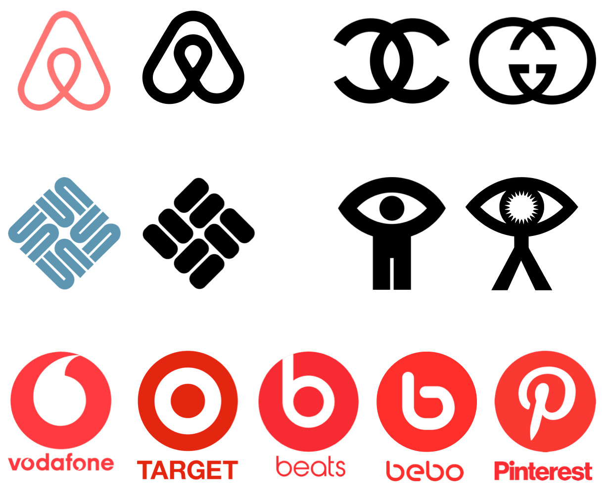
Shared Inspiration Doesn’t Mean Copying
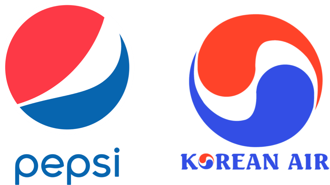
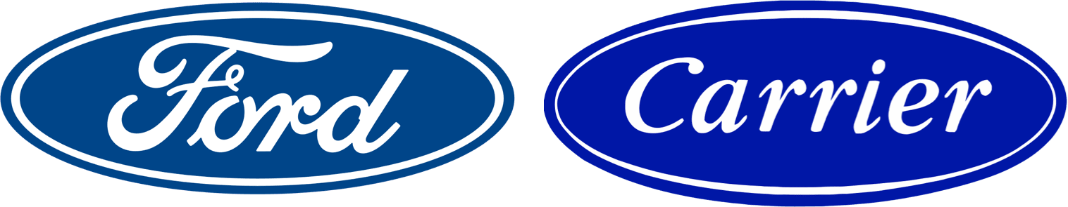
Many successful brands use similar designs and thrive despite those overlaps. For instance:
-
The Pepsi logo resembles the Korean Air logo.
-
The Ford emblem shares design elements with Carrier.
These companies operate in entirely different industries and have created unique identities despite visual similarities.
Context Makes the Difference
A logo doesn’t exist in isolation—it exists within a context shaped by your brand’s industry, mission, and messaging.
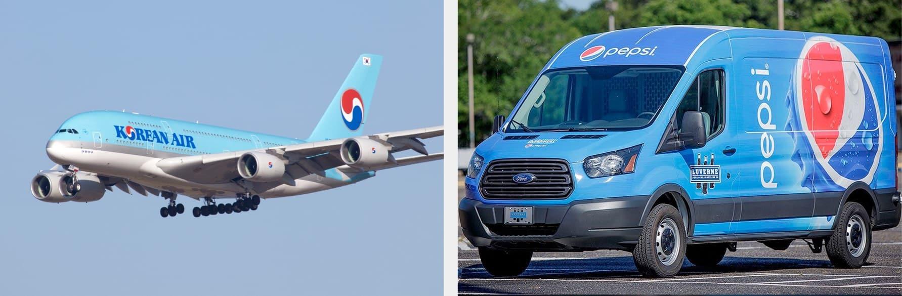
Consider this: If a traveler sees a Korean Air logo on an airplane wing, they won’t confuse it for Pepsi. Why? Because the context—the airplane, the boarding gate, and the passenger experience—defines the meaning of the logo.
Logos gain their identity through their surroundings and usage, making the brand behind the symbol far more significant than the design itself.
Legal Perspectives on Logo Similarities
It’s not illegal to have a logo similar to another brand as long as:
- Your businesses operate in different industries.
- There’s no risk of customer confusion.
For instance, if a lingerie company’s logo looks like a steel mill’s, it’s perfectly acceptable. Problems arise only when businesses with similar logos compete directly in the same market.
Similarity Doesn’t Mean Sameness
Even logos with apparent similarities can carry vastly different meanings. Take Versace and Starbucks:
- Versace uses the head of Medusa to symbolize its hypnotic and sophisticated fashion.
- Starbucks features a siren, reflecting its Seattle origins and connection to the sea.
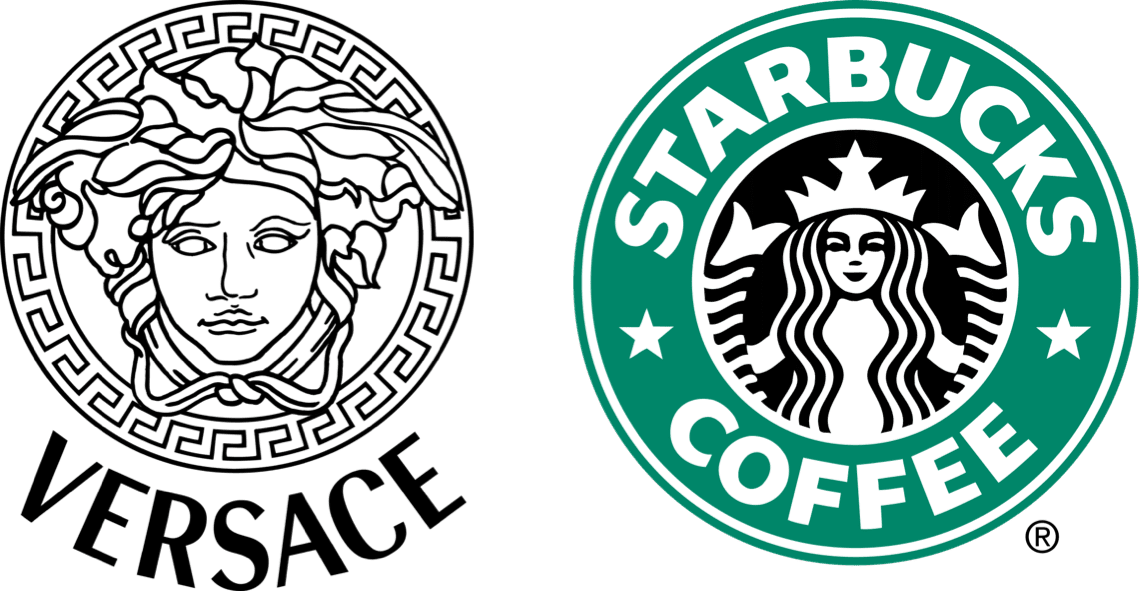
Though both logos feature mythological figures, their meanings are entirely distinct because of the brands’ stories and industries.
Conclusion
You don’t need a completely unique logo to succeed—what matters is the meaning and story you build around it. By focusing on your brand’s values, context, and message, you can turn any design into something uniquely yours.
Ready to craft a brand identity that stands out—even if it shares some similarities? Partner with agency.pizza to create visuals that resonate, captivate, and connect. Let’s bring your story to life.


